20 Free Font Pairings (and how they pertain to your brand)
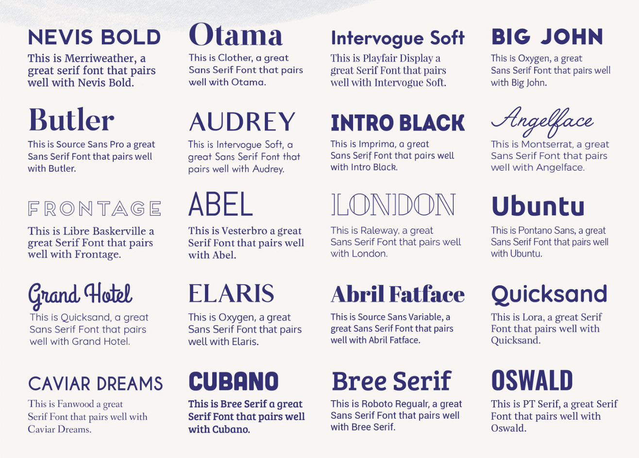
Pairings in order
Nevis Bold + Merriweather / Otama + Clother / Intervogue Soft + Playfair Display / Big John + Oxygen / Butler + Source Sans Pro / Audrey + Intervogue Soft / Intro Black + Imprima / Angelface + Montserrat / Frontage + Libre Baskerville / Abel + Vesterbro / London + Raleway / Ubunto + Pontano Sans / Grand Hotel + Quicksand / Elaris + Oxygen / Abril Fatface + Source Sans Variable / Quicksand + Lora / Caviar Dreams + Fanwood / Cubano + Bree Serif / Bree Serif + Roboto Regular / Oswald + PT Serif
One of the many thick branches that grow off the magical graphic design tree is typography. Typography can mean many things, and there are various lessons that lie within this lengthy topic that can be fun and interesting or just straight up annoying or boring.
… Let’s not go too deep into the world of typography for today and focus specifically on Font Pairing and why it’s important for your brand.
Your probably wondering, what the heck is a font pairing?
I get it, all of these design terms can be confusing and overwhelming. Which is why I wanted to create this blog post for anyone that has questions about fonts and Font Pairings and why having a pair of fonts is important for your brand.
What Is A Font Pairing?
In the simplest form, a Font Pairing is when you pair fonts that look great together! Typically the pair includes a Headline Font and a Body Copy Font
Why Do I Need Font Pairings For My Brand?
Every design! Websites, books, posters, brochures, signs, etc. has a form of word hierarchy. What do I mean by hierarchy?
The most important information should stand out to the viewer first.
On a poster, the most important information is the headline of an event. On a website, it’s the title of a blog post. On a business card, it’s the name of the person or the company.
The first thing you read is (usually) what I call a “Headline Font” This font can be many different types of fonts, the only factor that it MUST HAVE is that it should overpower the “Body Copy” font.
What You Should Consider When Choosing Fonts For Your Brand
How I personally like to pick my pairings is by matching a Serif Font with a Sans Serif Font because I believe the two contrast very well together. However, this is not a must.
There really are no specific rules accept I would urge you to consider the following:
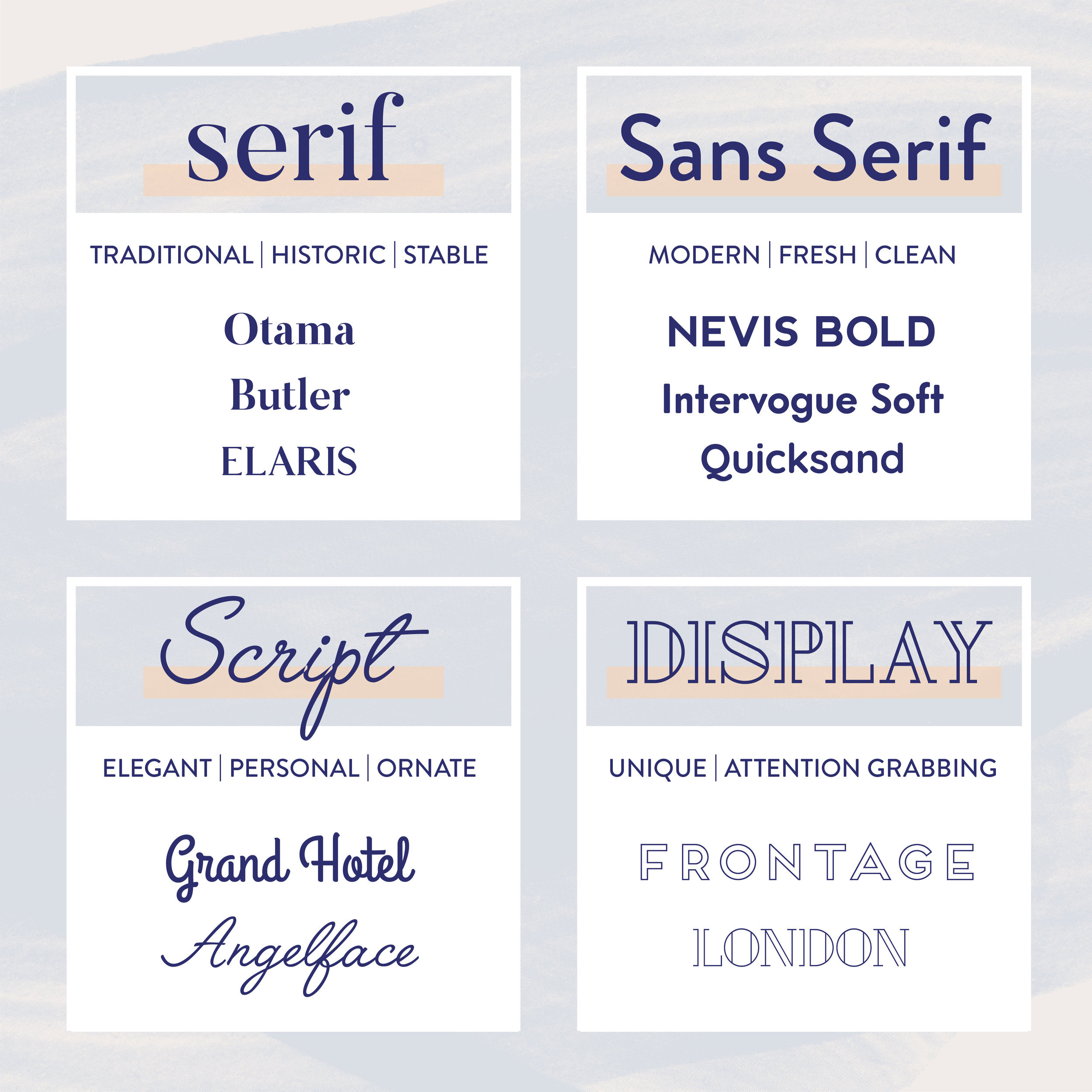
Consider the Different types of fonts:
SERIF - has the little decorative flourishes on the ends of the lines on the letterforms
SANS SERIF - is without the decorative flourishes on the ends of the lines on the letterforms
SCRIPT - is like cursive or calligraphy
DISPLAY - These are usually the crazy, fun, decorative and different types of fonts.
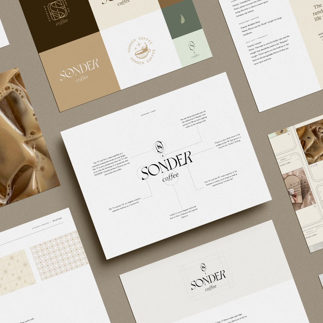
It is so important when it comes to branding that you choose the right pair of fonts that express the personality of your brand and also compliment your logo.
For example, if you want your brand to be represented as serious and traditional, I would recommend using a Serif font as your headline font and if you want to be thought of as more fun and care-free, I suggest using a display font or a script font
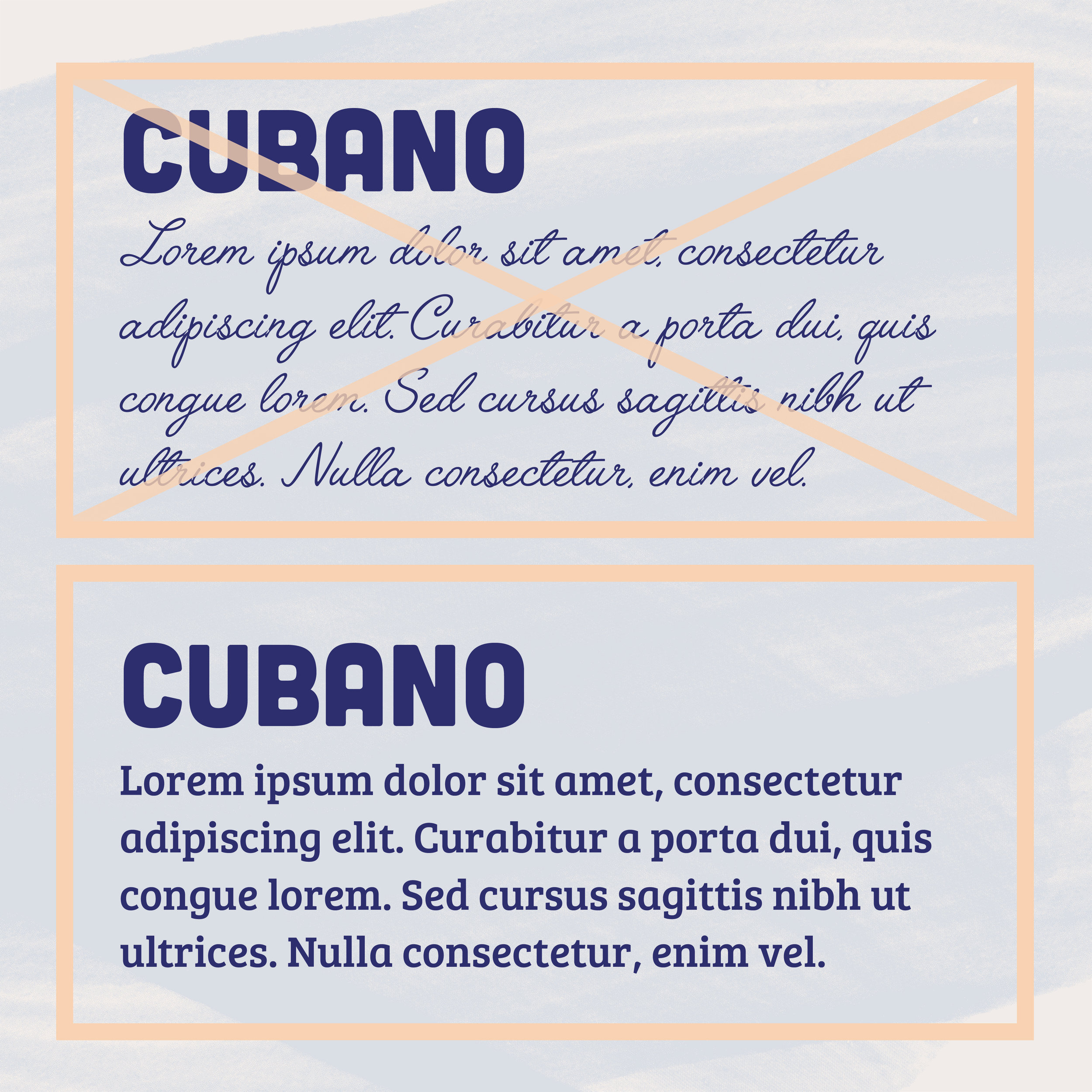
Don’t use something intricate or too crazy of a font for your Body Copy Font because it would be very hard to read lengthy paragraphs using a crazy font for your body copy.
If your business is mostly online, you may want to consider making sure your picking “Web-Safe” fonts. Believe it or not, there are fonts out there that don’t work well online, and don’t offer the “Web-Safe” file version which is WOFF.
If you’d like to learn more about the different file type of fonts you can read more here.
CONCLUSION
All in all, it’s really about playing with different fonts and seeing what works well together, I like to put fonts on business cards, on my website, on my social media, etc and see how they look before I decide.
Also, your taste of fonts may change over time. I definitely don’t recommend changing your brand fonts but I know I started out with fonts that I no longer use today and as more new and “trendy” fonts came out, I decided to change them because they worked better for certain situations.
I hope this has been fun and educational! I know talking about fonts isn’t always the greatest topic to talk about but it’s definitely necessary to have an understanding of how they work.
Feel free to reach out to me if you have any questions!


