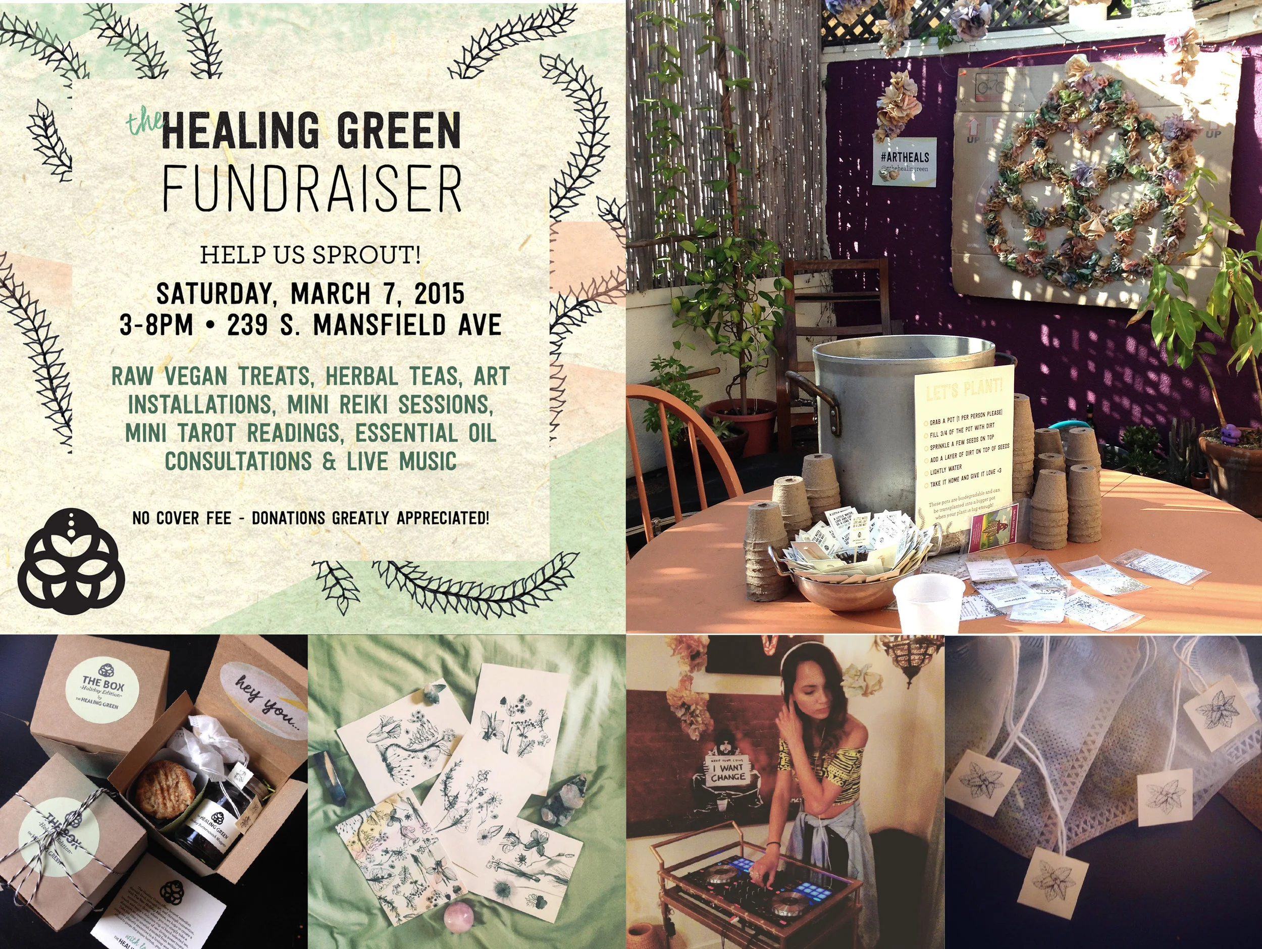
creative brief
The Healing Green was a business that wanted to bring people together through food, art and connection. The idea is that when the 3 components were put together one would experience and energetic "buzz".
result
After getting to know more about The Healing Green, the words fun, spiritual and earthy are only a few of many words I would use to describe their wonderful business. I used those words as the foundation of starting the brand identity process.
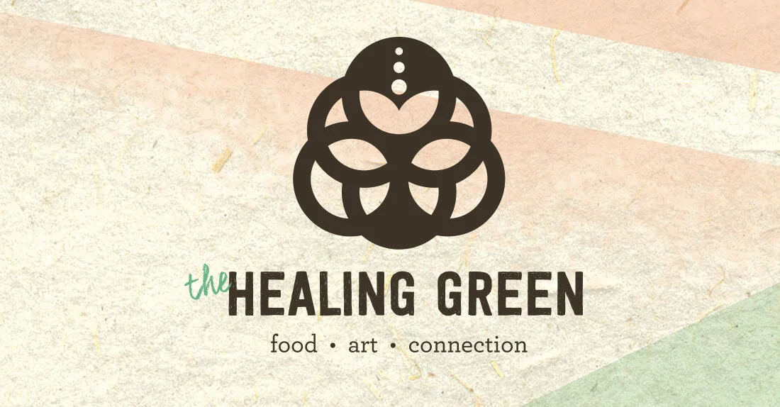
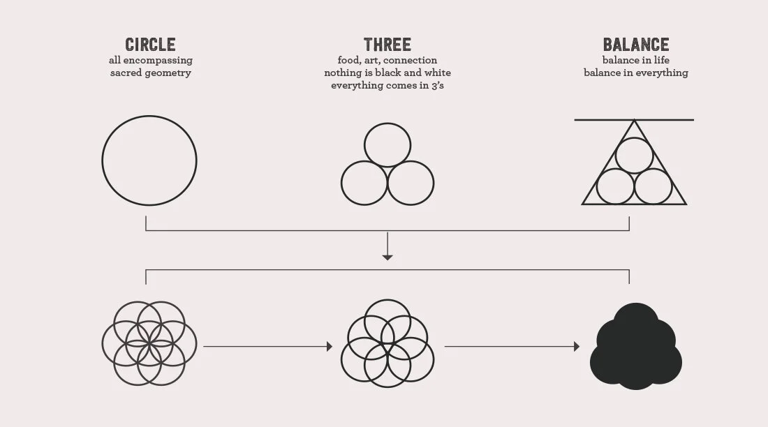
Logo Story
The logo turned into a beautiful and timeless mark. A circle was the first shape that came to mind when thinking about spiritually and ascension. Combining the circles in this way creates many meanings to the viewer. A tree in the middle represents growth, the roundness gives an organic feel and the three dots ascending is another representation of prosperity.

COLOR PALETTE
The choices of color for this palette are vibrant and earthy. Dark brown and green being the earth tones and lime green and light orange to contrast the earthy hues.