Concept Brand Identity
creative brief
Naimies is a professional beauty supply store that has provided services to studio makeup artists and hair stylists since the 70’s. Naimies provides both professionals and the average beauty consumer with a huge variety of the latest products in hair, skin care, makeup and special effects. Naimies gives their customers access to competitive brands that cannot be found in any other store.
result
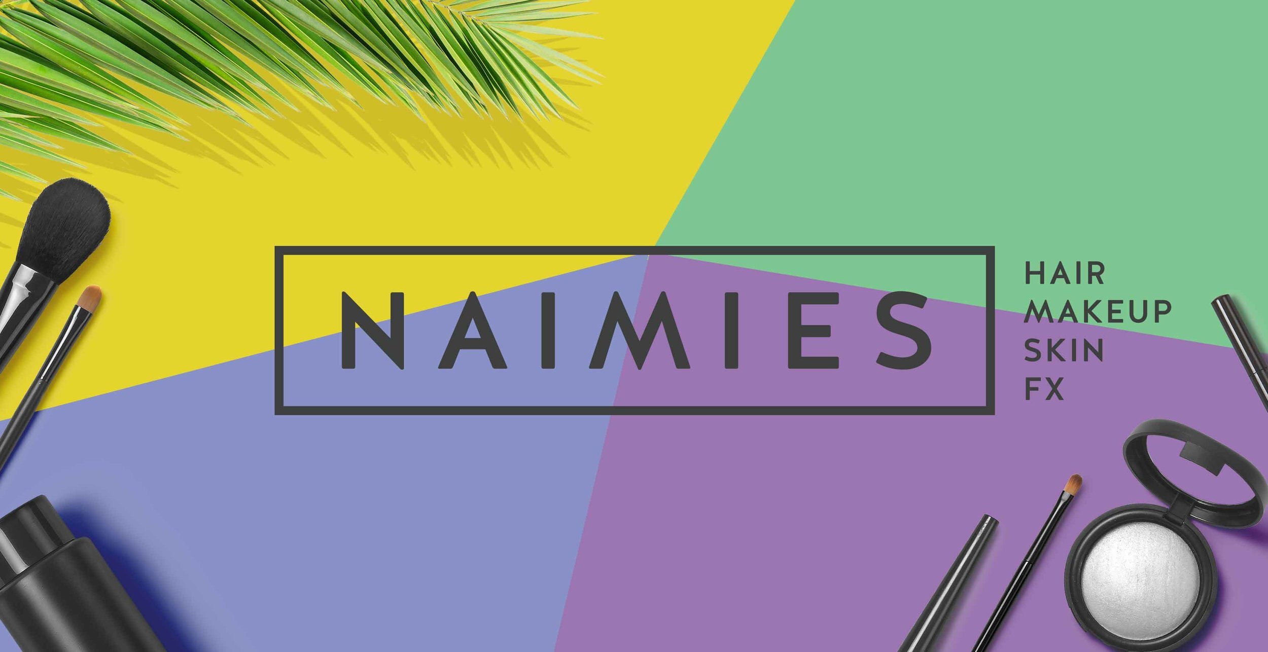
The challenge was to represent how Naimies is the ultimate beauty supply store for all types of beauty professionals. It's simple, clean with the contrast of a fun/wild side. Naimies wants the customer to think they can do it themselves, like an artist walking into an art store picking all of their tools and mediums they need to create something beautiful.
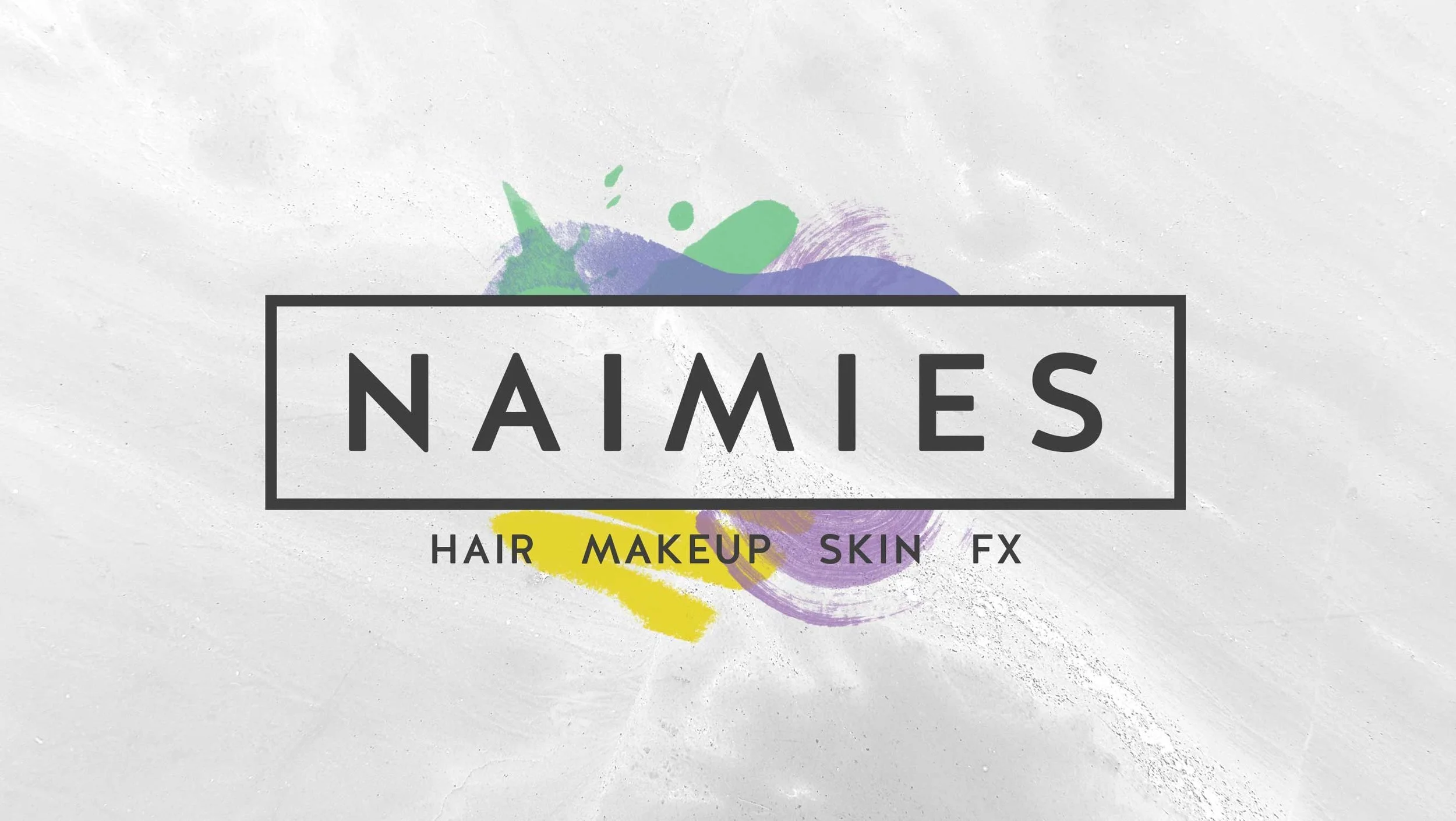
Logo Story
The logo has the perfect amount of professional and wild. The four brush marks represent the four types of products Naimies offers (hair, makeup, skin & special effects). The font chosen for the logo is clean and sleek with friendly rounded accents on the corners of each letter. The spaces in between and around the letters represent size, quantity and wholesomeness of what Naimies Beauty has to offer their customers.
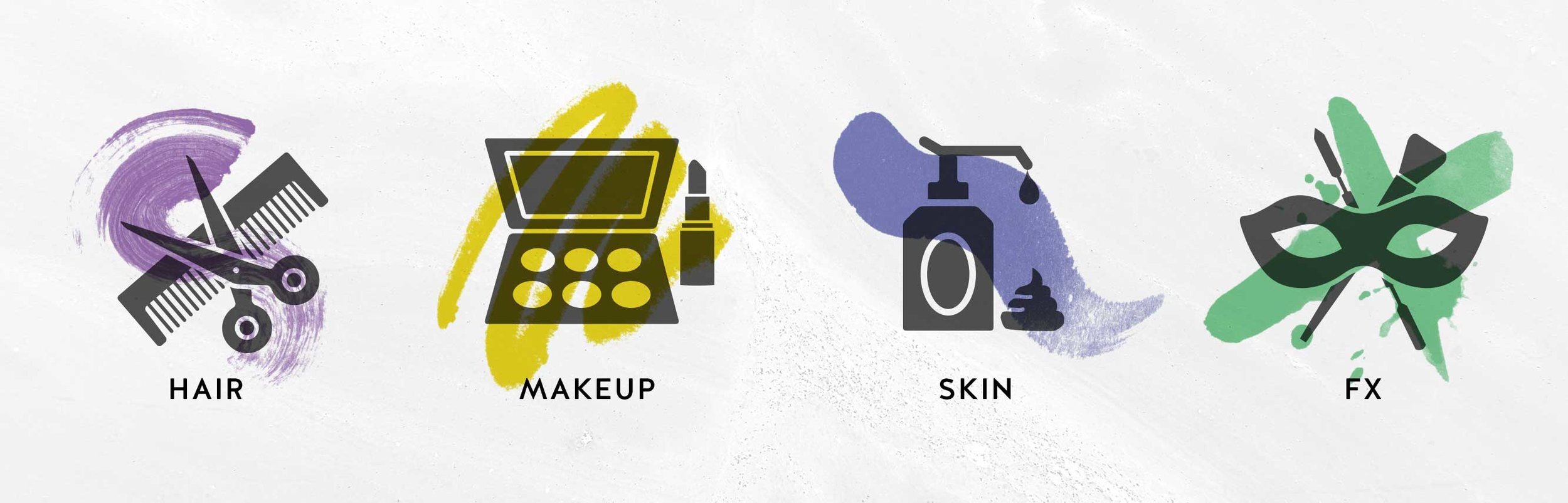
Icon design
It is important to tell the story of the brush marks behind the logo. Each one represents the types of products Naimies offers (hair, makeup, skin & special effects). Each mark also alludes to the different mediums and liquid textures that a stylist or makeup artist uses each day. The drips on the FX icon represent fake blood for special effects, the crayon like mark for makeup represents eyeliner, the dry brush strokes for hair allude to strands of hair and the skin mark is a soft wash that depicts smooth skin or lotion.
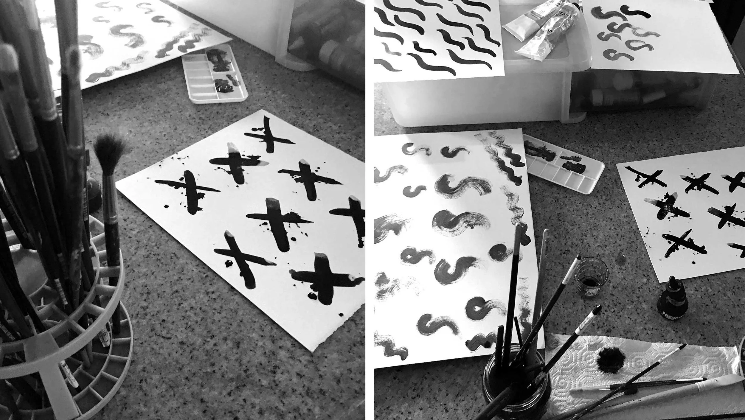
The marks
Each mark is custom and created by hand so that the logo and icons are completely unique.
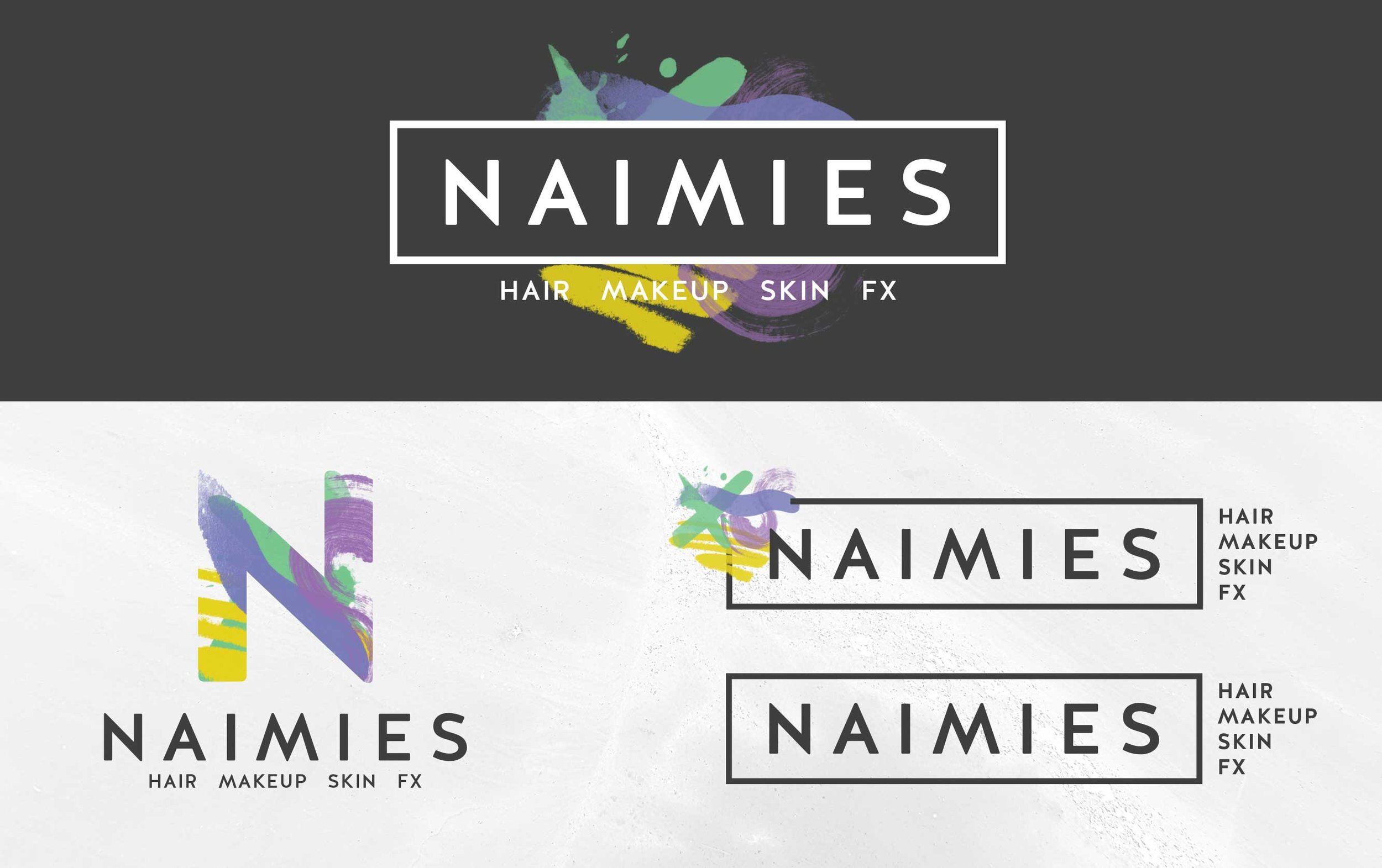
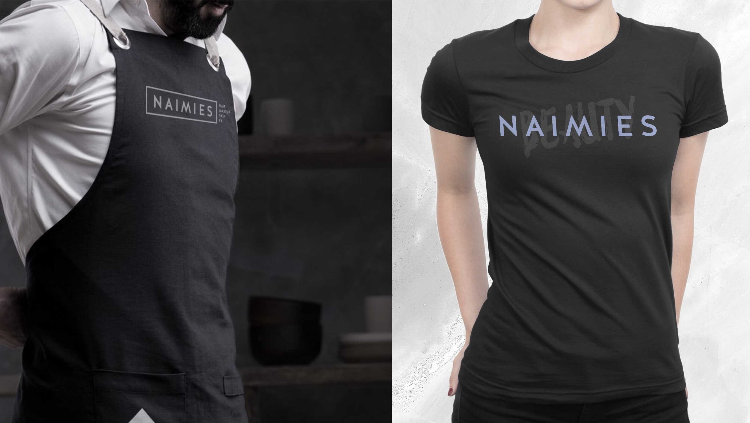
Secondary logos
It is important to have secondary logos for every situation. You can have the full logo on a business card and a simple one if needed for a one-color process t-shirt.
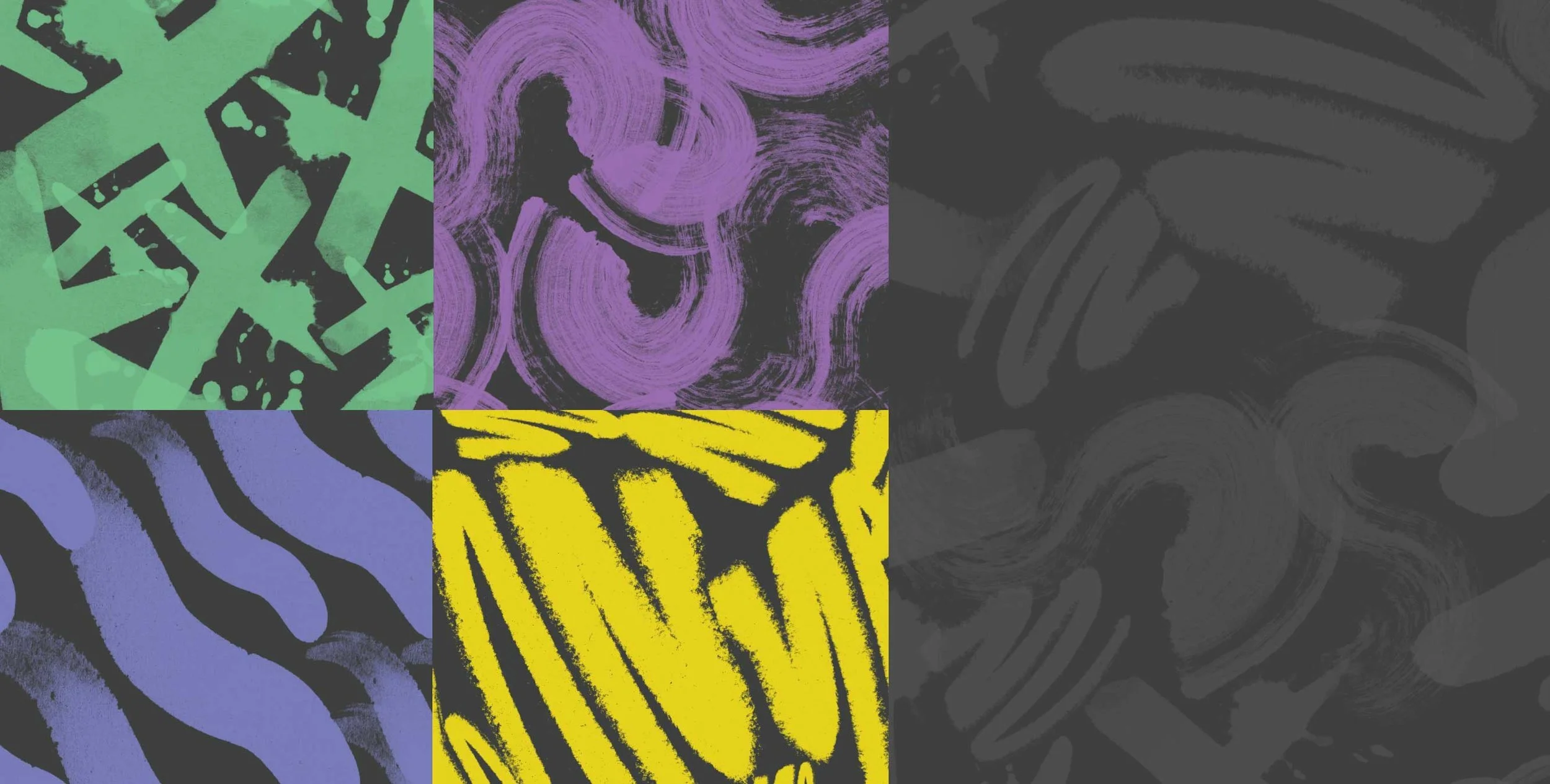
Patterns
A pattern was created for each of the icon marks, along with one primary grey pattern that has all of the marks in it. All can be used for social media, gift wrap paper, cards, etc.
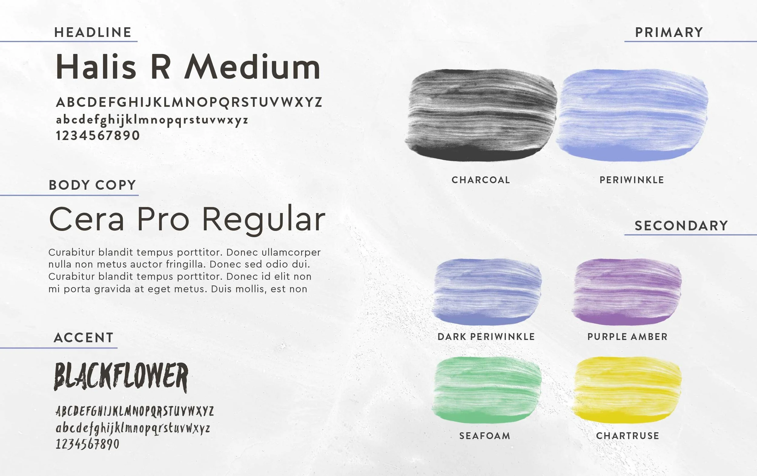
Color Palette
The color palette was actually one of the most challenging parts of this project. The brand had to stay away from black, pink, red and orange while still remaining colorful, professional and fun. Instead of using black, charcoal (dark grey) was a good solve against the brighter fun colors. Cool colors with a happy yellowish/green chartruse makes this brand stand out from all of the other beauty supply stores.